What Do “the People” REALLY Think?
We are bombarded from social media, the press, and politicians with statements like “The people of the U.S. think [this or that],” but they often are not backed up with any statistics or data. The next time you see a claim like this and think to yourself, “I wonder where I can find some data to support or refute that…” the General Social Survey, or GSS for short is a time-honored and trusted place to look.
What’s the General Social Survey (GSS)?
 Conducted approximately every other year since 1972, the GSS tracks hundreds of trends in social characteristics and attitudes over the past four decades. While not a survey of the entire U.S. population, it is a full-probability, national-level sample survey – in layman’s terms, that means you can be pretty confident that the opinions of the ~2,000 people surveyed in any given year generally reflect those of the U.S. population at that time.
Sounds legit! So how do I use the GSS to find data to support or refute something I heard or read?
There are a couple of tools for exploring GSS data online: the SDA (Survey Documentation and Analysis) tool and the GSS Data Explorer. I’m going to use the SDA in this post – I provide various visuals below to illustrate the steps in using it, and here are some short video tutorials on using the SDA.
Case scenario: Someone you follow tweeted this:

First, you’re curious to see if the GSS data backs up this statement. Second, you’d also like to explore if opinions about this differ depending upon whether someone thinks of themselves as liberal vs. conservative.
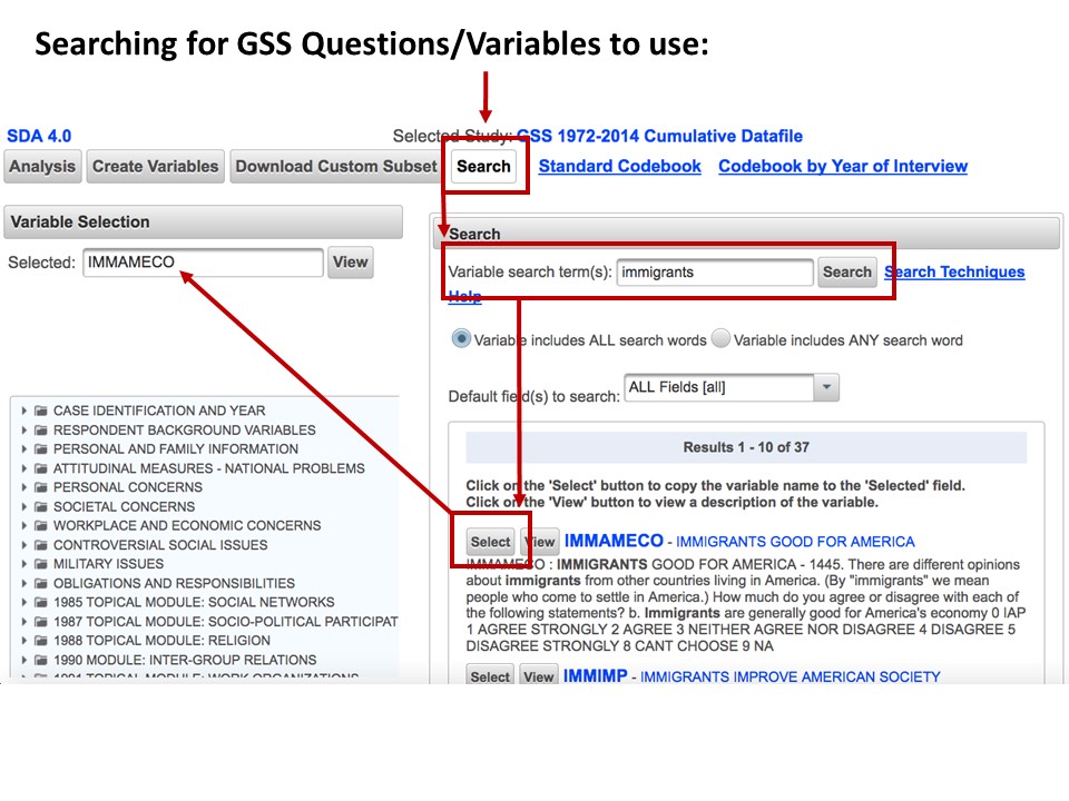
First you have to find GSS survey questions (aka variables) that asked about immigrants. On the SDA main page, click the Search button (top center, next to Standard Codebook link), type immigrants in the Variable search term(s) search field, and click the Search button next to that field. You’ll then get a Results list of the 37 different questions asked across the years that had the word ‘immigrants’ in it and what the questions specifically asked. You decide that this one looks good for your purposes:
IMMAMECO – IMMIGRANTS GOOD FOR AMERICA: How much do you agree or disagree with the following statement? Immigrants are generally good for America’s economy.
Click the Select button next to it, and you’ll see it shows up at the left in the Variable Selection section’s Selected field. Below is a visual of the above steps to help you out:
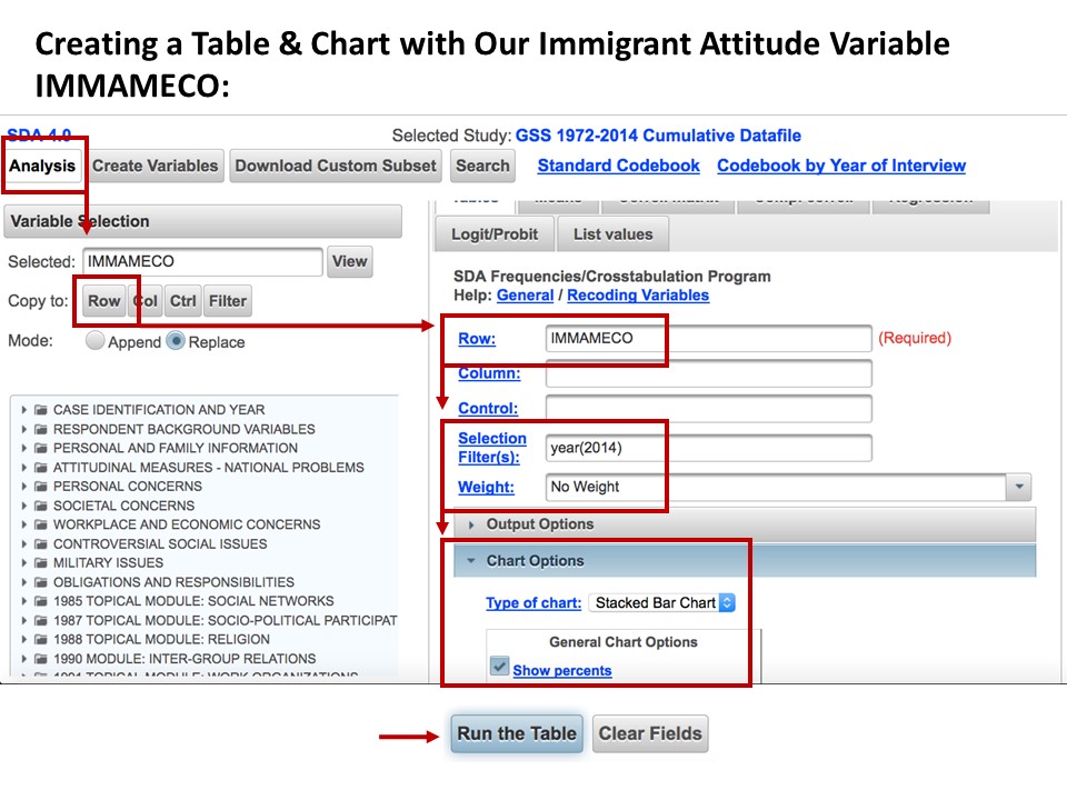
 Now click the Analysis button (top left of SDA window), and click the Row button in the Variable Selection area to have the IMMAMECO question added to the Row field for your table you’re going to generate to look at this variable. To see only the most current data from year 2014, in the Selection Filter(s) field type year(2014), and right underneath that change the Weight dropdown to No Weight. Click the Chart Options dropdown, and in the General Chart Options area checkbox the Show percents option. Finally, click the Run the Table button at the bottom of the screen. A visual of the above steps:
Another browser tab will open with: (1) a table containing the percentages (in bold) and counts broken down by question answer for the 1,226 surveyed people who answered this question, and (2) a stacked bar chart with the percentages broken down by question answer. Below are the table and stacked chart that I marked up a little bit (in red) to help us interpret the results:
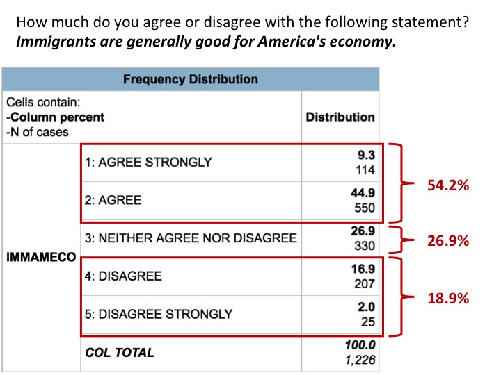
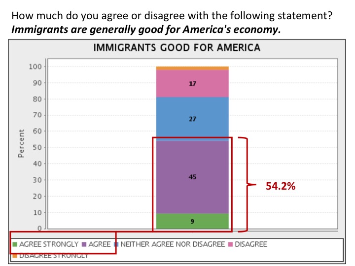
My interpretation is that the GSS data for 2014 *do not support* the tweeted statement that “People in the U.S. think that immigrants are bad for the economy” – in fact, the majority (54.2%) agreed strongly or agreed that immigrants are generally good for America’s economy, whereas 26.9% were neutral and only 18.9% disagreed strongly or disagreed with the statement.
Now you want to explore whether this opinion is influenced by whether someone thinks of themselves as liberal vs. conservative. Or, in statistics language: you want to see if your independent variable of “liberal vs. conservative” has an effect on your dependent variable of “immigrants are generally good for America’s economy.” Like before, we’ll use the Search capability to find a variable/question that asks whether the people being surveyed think of themselves as liberal or conservative. I used the search terms liberal conservative and identified this variable that seems good for our purposes:
POLVIEWS – THINK AS SELF AS LIBERAL OR CONSERVATIVE: I’m going to show you a seven-point scale on which the political views that people might hold are arranged from extremely liberal – point 1 – to extremely conservative – point 7. Where would you place yourself on this scale?
Click the Select button next to it, and you’ll see it shows up at the left in the Variable Selection section’s Selected field. Now click the Analysis button (top left of SDA window), and click the Col button in the Variable Selection area to have the POLVIEWS question added to the Column field for your table. Keep all the other stuff as is and click the Run the Table button at the bottom of the screen. A visual of the above steps:
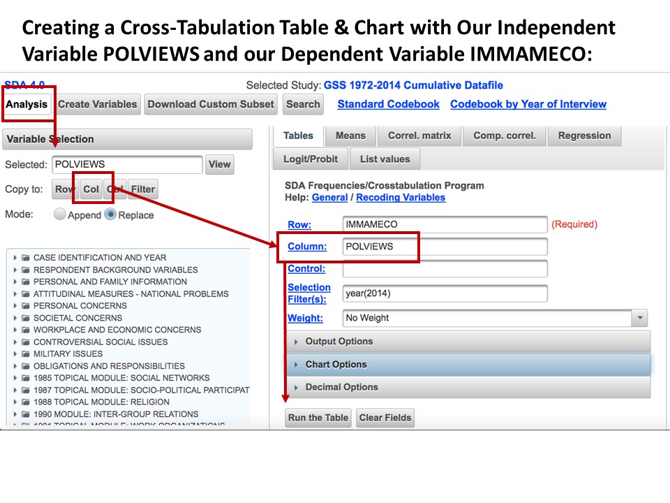
Another browser tab will open with: (1) a cross-tabulation table with percentages (in bold) and counts of those within each POLVIEW variable category broken down by their answer to the IMMAMECO question, and (2) a stacked bar chart with percentages broken down the same way. To save space I’m just going to include the stacked chart below for our interpretation (with some mark up by me in red and blue):
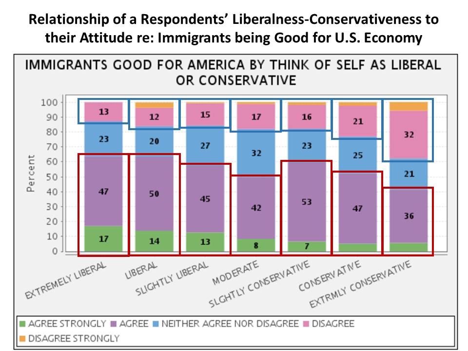
So what does this chart seem to tell us about the relationship of these variables?
- As we move across the horizontal axis from respondents saying they were ‘extremely liberal’ to those saying they were ‘extremely conservative’ and we focus on the combined green (‘agree strongly’) and purple (‘agree’) sections of the bars marked in red, we see that the sections stay pretty much the same size for ‘extremely liberal’ and ‘liberal’ (each about 64%), get progressively smaller for ‘slightly liberal’ (58%) and ‘moderate’ (50%), spike up again for ‘slightly conservative’ (60%), then get progressively smaller again for ‘conservative’ (52%) and ‘extremely conservative’ (42%). In other words, generally the more conservative a respondent rated themselves (with a bit of an anomaly for those considering themselves ‘slightly conservative’), the less likely they were to agree with the statement that “immigrants are generally good for America’s economy.”
- Similarly, moving across the liberal-to-conservative scale and focusing on the combined orange (‘disagree strongly’) and pink (‘disagree’) sections of the bars marked in blue, we see that the sections while pretty close in size do get progressively bigger moving from ‘extremely liberal’ (13%) to ‘slightly conservative’ (18%), then do a bit bigger jump in size at ‘conservative’ (23%) and a comparatively bigger jump in size at ‘extremely conservative’ (38%). So, generally the more conservative a respondent rated themselves, the more likely they were to disagree with the statement that “immigrants are generally good for America’s economy.”
- Now, before we conclude that conservatives think immigrants are bad for the U.S. economy, we should still note that a majority (60%) of those rating themselves as ‘slightly conservative’ strongly agreed or agreed that immigrants are generally good for America’s economy, and 52% of ‘conservative’ respondents did as well. And, while less than the majority (42%) of ‘extremely conservative’ respondents strongly agreed or agreed that immigrants are generally good for America’s economy, it was still more than those that strongly disagreed or disagreed with the statement (38%). So, while comparatively smaller than their liberal-leaning counterparts, a larger proportion of the conservative-leaning respondents still felt that immigrants were generally ‘good’ for America’s economy over ‘bad’ for it.
If we downloaded this data into a statistical software package like SPSS, SAS, or R to run tests of statistical significance, we could make more definitive conclusions about the relationship between these two variables. But even without doing complex statistical analyses, we still get a basic sense that liberals and conservatives are not as polarized on this particular immigrant issue as some would have us think.
The GSS is pretty cool! How might I use it for things other than disproving tweets? And what other data is just out there waiting for me?
Great question! The GSS has hundreds of questions on all kinds of topics and all kinds of social characteristics, so the sky’s the limit on its uses. Similar to what I did in this post, you might use some basic statistics from it to illustrate a point in a paper or presentation for one of your classes. If you’re interested in doing more thorough analysis of GSS or other data, you might consider taking a statistics class to get the necessary statistical knowledge to perform in-depth analyses.
Interested in learning more about data and statistics? Explore the Library’s guide for finding statistical information and data, come to a data-services workshop, or contact a member of our Research Data Services Team. We want to arm you with data for success in your academic life and beyond!