How a Densely Populated Neighborhood Became Turner Field: A Map Essay
With the unexpected announcement that the Braves will leave the Atlanta neighborhood of Summerhill for suburban Cobb County, many in the city are left to speculate what will become of the Turner Field complex after the Braves make their departure. Shortly after the news broke on November 11th, Mayor Kasim Reed alluded to future redevelopment plans for Turner Field. In a statement quoted by Creative Loafing, Reed noted that “over the next three years, we will be working with our prospective partners to bring residential and business development that is worthy of our city and strengthens our downtown.” As city officials contemplate the future of this large area just south of downtown, it is important to remember that 60 years ago, before Atlanta–Fulton County Stadium and Turner Field were built, the entire space was once a neighborhood complete with a mixture of residential and business structures.
This photo essay (in this case more of a map essay) uses a selection of maps from the 1940s to the 1990s to chronicle the redevelopment of almost 50 percent of Summerhill from what was once a densely populated neighborhood – which was seamlessly connected to downtown – to that of a sparsely populated neighborhood, which is now geographically isolated from downtown due to the construction of several highways and an immense parking lot. In each of these maps, the yellow rectangle represents the actual space occupied by the Turner Field complex. Click on each map for a higher resolution image.
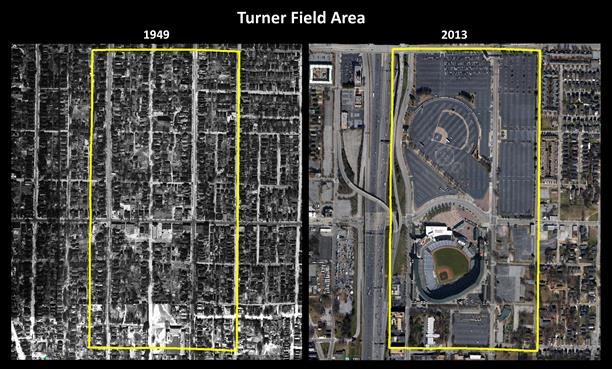
The Turner Field area in 1949 and in 2013.
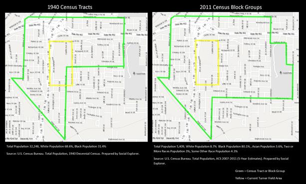
Although the Turner Field area is geographically too small for a historical population count, in 1940 the area currently occupied by Turner Field and the area immediately surrounding it had a total population of 32,248 (68.6% white and 31.4% black). By 2011, that area’s total population had decreased to 5,409 (8.7% white, 80.1% black, 3.6% Asian, 3% two or more races, and 4.3% some other race). Census boundaries change over time, so it is difficult to compare exact geographic areas. Although the maps above are not exact geographic correlations, they clearly show the population decrease and racial change of the area around Turner Field.
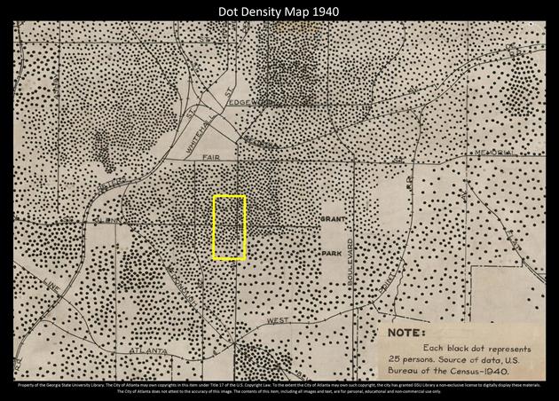
This 1940s dot density map depicts a once densely populated area.
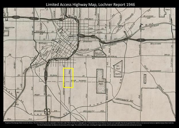
This 1946 Lochner report shows the proposed expressway further from the future Turner Field.
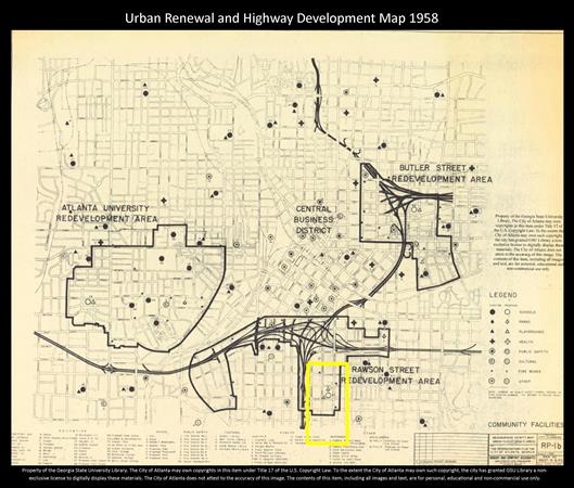
The first in a long series of changes to the area that would become Turner Field began with the development of the highway system and urban renewal projects.
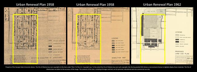
In the mid-1960s, seeking a location to construct a baseball stadium, Mayor Ivan Allen commandeered land from the Rawson Street urban renewal project to construct his baseball stadium. This land, which was originally designated for residential use, became the site of the Atlanta–Fulton County Stadium, the original home of the Atlanta Braves. Commenting on the stadium years after it was built, Allen stated, “We built a stadium on ground we didn’t own with money we didn’t have for a team we hadn’t signed.” (Keating, 2001, 99) The above series of urban renewal maps depicts structures before they were demolished and also shows the northern section designated as residential and the middle section as a location for a school.
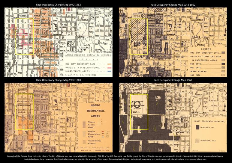
Beginning in the early 1950s many Atlanta neighborhoods began to experience heightened racial tensions as African Americans moved into sections of the city that whites traditionally thought of as white residential areas. This series of maps shows the changing racial makeup of the area surrounding the stadium. For more on this topic, see White Flight: Atlanta and the Making of Modern Conservatism, by Kevin Kruse, 2005.
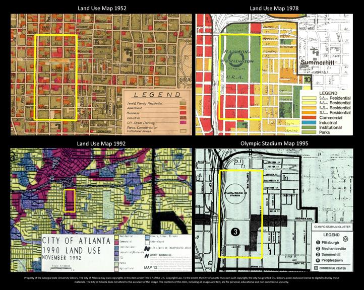
Ultimately, urban renewal and land-use changes sealed the fate of this area. This series of maps depicts imposed land-use changes, each of which severely altered the residential character of the neighborhood.
For more in-depth information on this topic see:
- “The Other 284 Days” in Atlanta Magazine, by Rebecca Burns, 2013
- Atlanta: Race, Class, and Urban Expansion, by Larry Keating, 2001
- Race and the Shaping of Twentieth-century Atlanta, by Ronald Bayor, 1996
With the exception of the census tract and block group maps, which are from Social Explorer, all maps in this essay are from the Georgia State University Library Planning Atlanta: A New City in the Making, 1930s – 1990s collection, which is a National Endowment for the Humanities funded project. These maps can be accessed from the Planning Atlanta collection site. However, as this project is still in development, several of the maps used are currently not available in the collection. Contact Joe Hurley for any questions about these maps or the collection.
