Fighting for Freedom Exhibit Design
Designing an effective exhibit requires collaboration and communication to bring to life the vision and message the exhibit theme hopes to convey. As the exhibit designer my role involves taking the text, photographs, and archival materials selected for the exhibition’s theme and piecing them together in a way that will create a unified and impactful piece for the audience to enjoy. This process relies heavily on communicating with the exhibition team and figuring out a way to tell a cohesive story in the space provided. Each exhibit will have its own challenges and its own voice, and the designer’s role is to bring it all together.
For Fighting for Freedom, the bulk of the exhibition highlights items curated by the archivist and exhibit team from the Southern Labor collection with a focus on civil rights and labor union materials. From the beginning of this process there was a sense early on that thematically the design would need to reflect the boldness, strength, and struggle that the subjects of the collection materials underwent. This meant selecting design elements that would feel bold and complimentary to the archival materials without altering the context. Early choices in the process include selecting the color palette and font choices that would work together thematically. Originally in the design process the color palette included red, black, and white as the dominant color theme for the panel design. However, over time it became clear that the colors were too overpowering in contrast with the materials and created legibility issues. The color palette was altered to red, navy, and gray (inspired by labor union colors) which still carried the boldness of the theme but competed less with the materials.
(Image 1: Progression and variations of the exhibit title design, with altering color choices.)

One of the challenging aspects of exhibit design is figuring out how to creatively display archival materials that will catch the eye of the viewer. This includes creating cohesive panel layouts that will present the exhibit text and exhibit materials that are easy to follow in a non-linear form. For this exhibit, which includes numerous documents and text-based materials, it was important to provide excerpts of materials for the audience to engage with and entice the viewer into reading more. An exhibit panel full of text-based materials may get overlooked when compared to an exhibit panel full of images and graphics, so designing panels that incorporate a balance of both creates a more engaging panel for the viewer to enjoy.
(Image 2: Exhibit panel showing the balanced approach to using text-based and image-based materials in a cohesive way.)

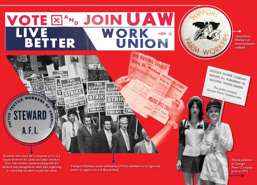
Visual items such as photographs can tie directly to the exhibit text by showing a specific event or put a face to the name of influential figures, but a wall of images may not supply the necessary context for the audience to appreciate what they are seeing. With this exhibit there were numerous images of demonstrations, strikes, and protest signs that could be repetitive for viewers. Playing with the shape and transparency of the images allowed a more creative approach to displaying the visual information while presenting the materials in a more engaging way. However, working with primary resources also means preserving the integrity and authenticity of an image or text so the content is not altered or used in a misleading way. Keeping this in mind, images were carefully selected to create cut out versions of the photographs to highlight demonstrators or objects that would have a greater impact without jeopardizing the original image.
(Image 3: Panel example showing how shape and transparency can be used with visual materials in a creative way.)

The final panels for Fighting for Freedom came together in a unified way after months of puzzle-piecing, trial and error, and bouncing off ideas with the exhibit team. As a designer this process can be tedious, but seeing the finished exhibit in person is a rewarding experience that I hope viewers will enjoy and engage with.
(Image 4: Before and after design changes from previous color palette to the final design choices.)

Interested in learning more? Attend the Fighting for Freedom Exhibit opening on 9/28 at 5. Register here!
The Special Collection & Archives department would like to thank our sponsors who helped make this exhibit possible: Council on Library & information Resources, Georgia AFL-CIO, IBEW Local 175, United Steelworkers District 9.
Written by Michelle Asci, Library Associate | Photographic Collections